Blog
Why Visual Design Matters: How Stunning Aesthetics Shape Customer Perception
Table of Contents
Toggle
In today’s hyper-competitive market, first impressions are everything. Whether it’s a website, app, or physical product, how something looks can make or break a customer’s perception in seconds. Visual design goes beyond mere aesthetics; it’s a powerful tool that communicates brand values, builds trust, and drives action. Here’s an in-depth exploration of why visual design matters and how stunning aesthetics can shape customer perception.
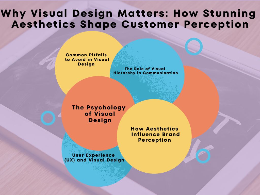
The Psychology of Visual Design
Visual design taps directly into human psychology. Our brains are wired to process visual information faster than text. Here’s how key elements of design influence perception:
1. Color Psychology
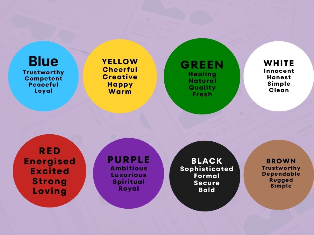
Colors are a silent language that evoke emotions and trigger subconscious associations. They work as a powerful tool to guide user behavior, influence decision-making, and create a mood that aligns with your brand identity.
How Colors Affect Perception:
- Blue: Often associated with stability, trust, and calmness. It’s no coincidence that financial services (PayPal, Visa) and tech companies (Facebook, LinkedIn) heavily use blue in their branding—it’s about reassuring users and promoting trust.
- Red: An attention-grabber that evokes strong emotions like urgency, passion, or excitement. It’s used strategically in sales promotions or warnings, as seen in clearance sale tags or Coca-Cola’s bold branding.
- Green: A versatile color linked to nature, health, and growth. It’s widely used by eco-friendly brands (like Whole Foods) or apps promoting financial growth (Robinhood).
Practical Application:
When designing, choose colors not just for their aesthetic appeal but for the emotions they trigger in your audience. A healthcare brand might lean on calming blues and greens, while a retail brand may strategically incorporate reds to encourage impulse purchases.

2. The Rule of Symmetry and Balance
Symmetry and balance are fundamental to creating visually harmonious designs that feel natural and organized to the human eye.
Why Symmetry Matters:
- Psychological Comfort: Humans find symmetrical designs more pleasing because they represent order and stability. For example, a centered logo and evenly spaced menu items create a sense of reliability.
- Professionalism: Balanced designs appear more polished and intentional. A lopsided or cluttered layout can make your website or product feel amateurish and untrustworthy.
Symmetry in Action:
- Horizontal Symmetry: Designs where elements mirror each other along a central line (e.g., a webpage divided into equal sections with text on one side and an image on the other).
- Asymmetrical Balance: Deliberate imbalance can also work if handled carefully, creating a dynamic yet cohesive look (e.g., a bold image on one side balanced by subtle text on the other).
Practical Application:
When designing a layout, ask: does it feel balanced? Experiment with grids or visual weights to create a structure that feels both harmonious and professional.
3. Typography’s Subtle Impact
Typography does more than display words—it conveys a tone and personality that can subconsciously influence how users perceive your brand.
Font Choices and Their Psychological Effects:
- Serif Fonts: These fonts, with small decorative lines or “feet,” feel classic, reliable, and formal. Think Times New Roman or Georgia—perfect for traditional industries like law, publishing, or academia.
- Sans-Serif Fonts: These modern, clean fonts like Arial or Helvetica evoke simplicity, minimalism, and approachability, making them ideal for tech companies or modern brands.
- Script Fonts: Elegant and artistic, script fonts convey luxury or creativity. However, they should be used sparingly to maintain readability.
Typography Hierarchy:
Typography isn’t just about font type; it’s about creating structure with font size, weight, and style:
- Headlines: Bold, large fonts grab attention and convey importance.
- Body Text: Smaller, lighter fonts ensure readability for longer content.
- Emphasis: Italics, bold, or colored text can highlight key points without overwhelming the reader.
Practical Application:
Choose fonts that align with your brand’s tone. If your brand is cutting-edge and tech-focused, a sans-serif font reinforces your modern identity. Use size and weight variations to guide readers through your content effortlessly.
How Aesthetics Influence Brand Perception
1. Establishing Trust
Customers are more likely to trust a company that invests in high-quality visuals. Clean layouts, professional photography, and consistent branding exude credibility.
Example:
Apple’s sleek design is synonymous with quality and innovation, shaping consumer expectations for premium products.
2. Enhancing Brand Recall
Memorable designs stick. A distinct visual identity—colors, logos, and layouts—helps your brand stand out in a crowded marketplace.
Example:
Nike’s minimalist swoosh logo is instantly recognizable, representing energy and performance.
The Role of Visual Hierarchy in Communication
Visual hierarchy is the arrangement of elements to guide the viewer’s focus. Designers strategically use size, contrast, and placement to emphasize key messages:
- Headlines grab attention with larger fonts or bold colors.
- Call-to-Action (CTA) Buttons stand out through contrasting hues.
- Whitespace creates breathing room, ensuring designs don’t overwhelm.
A well-executed hierarchy ensures users absorb the intended message without confusion.
User Experience (UX) and Visual Design
Aesthetics directly impact usability. Poor visual design can frustrate users, while stunning aesthetics enhance engagement:
- Clarity: Simplistic, clean designs improve navigation and reduce cognitive load.
- Consistency: Uniform visuals across pages create a seamless experience.
- Engagement: Visually appealing websites or products encourage longer interactions.
Case Study:
Airbnb redesigned its platform in 2014, emphasizing visual storytelling. This revamp led to higher engagement rates and positioned the brand as approachable and aspirational.
Common Pitfalls to Avoid in Visual Design
While aesthetics are crucial, they must align with functionality. Here are common mistakes:
- Overloading with Colors: Too many colors confuse rather than attract. Stick to a cohesive palette.
- Ignoring Accessibility: Poor contrast or illegible fonts alienate users with disabilities.
- Over-Designing: Excessive elements distract from the core message.
Tips to Elevate Your Visual Design
- Define Your Brand Identity: Understand your values and audience to craft visuals that resonate.
- Prioritize Mobile Design: Over 60% of web traffic is mobile—design accordingly.
- Invest in Quality Assets: Professional photography, custom graphics, and premium fonts elevate perception.
- Leverage Trends Wisely: Stay modern but avoid fleeting fads that might age poorly.
Final Thoughts: The Power of Stunning Aesthetics
Visual design isn’t just about making things look good; it’s about communicating a story, evoking trust, and driving action. Every element, from colors to typography, works together to create an experience that lingers in the minds of your audience. Investing in thoughtful and striking design can transform perceptions and ultimately shape your brand’s success.
Let your visuals speak louder than words—because in the eyes of your customers, beauty truly matters.
